We’ve all seen those eye-catching t-shirts that make us stop and stare – the ones with clever graphics, witty sayings, or stunning artwork that perfectly capture our personality. Creative t-shirt design has evolved far beyond basic logos and text, becoming a powerful form of self-expression and artistic storytelling.
Whether you’re an aspiring designer looking to break into the fashion industry or a business owner wanting to create memorable branded merchandise, mastering the art of t-shirt design opens endless possibilities. From understanding color theory and typography to choosing the right printing techniques, there’s a whole industry of creative potential waiting to be unleashed.
We’ll explore the essential elements that transform ordinary shirts into wearable masterpieces, covering everything from concept development to final production. Get ready to discover how innovative design choices can turn a simple piece of fabric into a canvas that speaks volumes about creativity and style.
Start With Bold Typography That Makes a Statement
Typography forms the backbone of memorable t-shirt designs, transforming simple words into powerful visual statements. We’ve discovered that the right font choice can instantly communicate your brand’s personality and capture attention from across a crowded room.
Choose Eye-Catching Fonts That Reflect Your Message
Select fonts that amplify your design’s core message and target audience. We recommend using bold, sans-serif fonts like Bebas Neue or Oswald for modern, edgy designs that demand attention. Vintage-inspired brands benefit from classic serif fonts such as Playfair Display or custom hand-lettered styles that evoke nostalgia.
Consider your design’s emotional impact when browsing font libraries. Playful designs for children’s clothing work best with rounded fonts like Quicksand or Comic Sans alternatives, while professional corporate designs require clean fonts such as Helvetica or Montserrat.
Test font readability at different sizes before finalizing your choice. We always preview our typography at actual t-shirt dimensions to ensure text remains legible from typical viewing distances of 3-6 feet.
Play With Letter Spacing and Size Variations
Adjust letter spacing (kerning) to create visual rhythm and improve readability. We typically increase spacing by 10-20% for bold fonts to prevent letters from appearing cramped together on fabric.
Create hierarchy using dramatic size differences between primary and secondary text elements. Main messages should be 3-4 times larger than supporting text, with the largest elements measuring 2-4 inches in height for optimal visual impact.
Experiment with mixed sizing within single words to add ever-changing energy. We often make the first letter 150-200% larger than remaining characters, or alternate between large and small letters for playful designs.
Combine Text With Visual Elements for Maximum Impact
Integrate typography directly into your visual design elements rather than treating them as separate components. We achieve this by having text follow curved paths around graphics, wrapping words inside shapes, or using letters as structural elements within illustrations.
Layer text behind or through images to create depth and sophistication. Transparent overlays at 70-80% opacity allow background graphics to show through while maintaining text readability.
Use text as texture by filling letters with patterns, gradients, or photographic elements. We frequently fill large typography with tie-dye patterns, geometric designs, or nature photography to create unique visual textures that enhance the overall composition.
Embrace Minimalist Design Principles for Maximum Effect
Minimalist t-shirt designs prove that less truly is more when it comes to creating powerful visual statements. We’ve discovered that stripping away unnecessary elements allows the core message to resonate more deeply with your audience.
Use Negative Space to Create Visual Interest
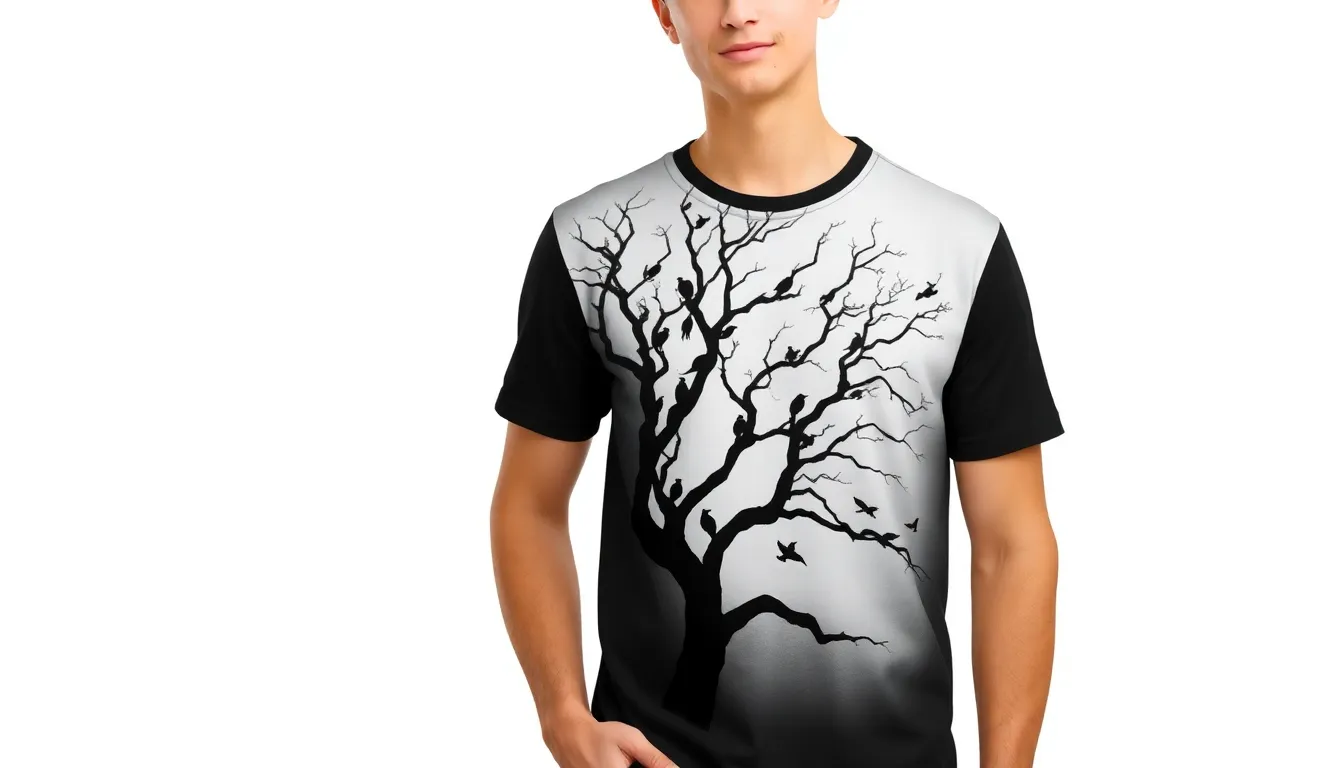
Negative space transforms ordinary t-shirt designs into sophisticated visual experiences. We recommend utilizing the empty areas around your design elements to create hidden meanings or secondary images that surprise and delight viewers. Consider how a silhouette of a tree can reveal birds in flight within its branches, or how typography can frame unexpected shapes in the surrounding white space.
Strategic placement of negative space guides the viewer’s eye across your design. We’ve found that leaving breathing room around key elements prevents visual clutter while creating a sense of balance and professionalism. Think about Apple’s iconic logo or Nike’s swoosh – both designs rely heavily on the power of what isn’t there to make what is there more impactful.
Creating optical illusions through negative space adds an element of discovery to your designs. We suggest experimenting with designs where the background and foreground swap roles, creating dual images that change based on how the viewer focuses their attention. This technique transforms a simple t-shirt into a conversation starter.
Focus on Clean Lines and Simple Color Palettes
Clean lines establish immediate visual hierarchy and professional polish in t-shirt designs. We prioritize geometric shapes, smooth curves, and precise edges that translate beautifully across different printing methods. Bold, unbroken lines maintain their integrity whether printed on cotton, polyester, or blended fabrics.
Limited color palettes create stronger brand recognition and cost-effective production. We recommend starting with a maximum of three colors for your design, including the shirt color itself. Monochromatic schemes using different shades of the same color create depth without complexity, while complementary color pairs like navy and gold deliver high contrast with timeless appeal.
Simple color choices enhance wearability and broaden your target market. We’ve observed that designs using classic combinations like black and white, or single accent colors on neutral backgrounds, appeal to wider audiences and coordinate effortlessly with existing wardrobes. This approach increases the likelihood of repeat purchases and word-of-mouth recommendations.
Let One Element Be the Star of Your Design
Focal point hierarchy ensures your message communicates instantly and memorably. We structure designs around one dominant element – whether it’s bold typography, a striking graphic, or an unexpected illustration – that captures attention within the first three seconds of viewing. Secondary elements should support, not compete with, your star performer.
Scale relationships between design elements create natural visual flow and emphasis. We size our primary element significantly larger than supporting graphics or text, establishing clear importance levels that guide the viewer’s attention. A large central graphic with small accompanying text creates more impact than multiple competing medium-sized elements.
Positioning your star element strategically maximizes its visual impact on the shirt. We place focal points slightly above the mathematical center of the design area, taking advantage of the golden ratio principle that naturally draws human attention. This positioning works particularly well for chest prints, ensuring the design remains visible even when partially obscured by jackets or bags.
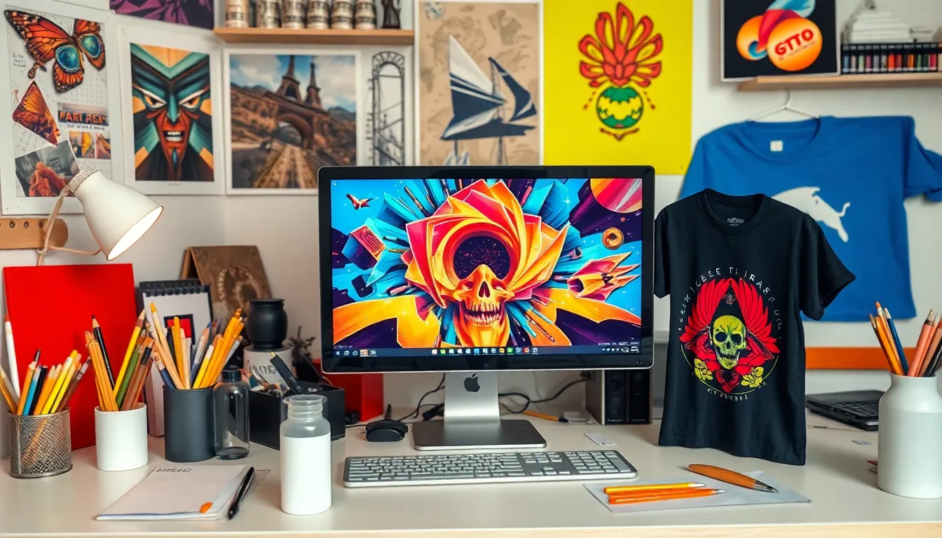
Incorporate Hand-Drawn Illustrations and Custom Artwork
Handcrafted artwork transforms ordinary t-shirt designs into unique pieces that connect deeply with audiences. Custom illustrations allow us to break free from stock graphics and create something truly distinctive that reflects our vision and creativity.
Create Original Sketches That Tell Your Story
Sketching forms the foundation of compelling t-shirt artwork that resonates with viewers on an emotional level. We recommend starting with pencil and paper to capture raw ideas before transitioning to digital formats. Personal experiences often provide the richest material for storytelling designs, whether it’s childhood memories, travel adventures, or cultural heritage.
Character development adds personality to our designs through expressive faces, ever-changing poses, and relatable situations. Abstract concepts work equally well when we translate emotions like joy, rebellion, or nostalgia into visual metaphors. Story-driven illustrations typically perform better than random artwork because they create instant connections with exact audiences.
Narrative elements should flow naturally across the t-shirt surface, considering how the garment moves and fits on the human body. We suggest sketching directly on t-shirt templates to understand how different body areas affect our artwork’s visibility and impact.
Use Digital Tools to Enhance Hand-Drawn Elements
Digital enhancement elevates hand-drawn sketches while preserving their organic charm and authenticity. We scan our original artwork at 300 DPI minimum to maintain crisp details during the digitization process. Adobe Illustrator and Procreate offer excellent tools for refining line work, adjusting proportions, and adding professional finishing touches.
Layering techniques allow us to experiment with different color combinations without affecting our original sketch. Vector tracing preserves the hand-drawn aesthetic while making our artwork scalable for various print sizes. Texture overlays can add depth and visual interest, mimicking traditional art mediums like watercolor, charcoal, or pen and ink.
Digital tools also enable us to create color variations quickly, test different backgrounds, and optimize our designs for exact printing methods. We maintain the handcrafted feel by avoiding over-polishing and keeping some imperfections that add character to our work.
Develop a Signature Style That Sets You Apart
Signature style development requires consistent practice and intentional choices across multiple design projects. We identify our strengths through experimentation with different techniques, from loose gestural drawings to detailed realistic illustrations. Color palettes often become the most recognizable aspect of our signature style, with exact combinations that audiences begin to associate with our work.
Line quality distinguishes our artwork from competitors, whether we prefer bold strokes, delicate details, or mixed media approaches. Subject matter preferences naturally emerge as we create more designs, gravitating toward themes like nature, urban landscapes, fantasy creatures, or social commentary. Consistent stylistic elements should appear across our portfolio while allowing room for creative growth and evolution.
Brand recognition increases when customers can identify our work without seeing our signature or logo. We build this recognition by maintaining consistent artistic choices while pushing creative boundaries within our established framework.
Experiment With Color Combinations and Gradients
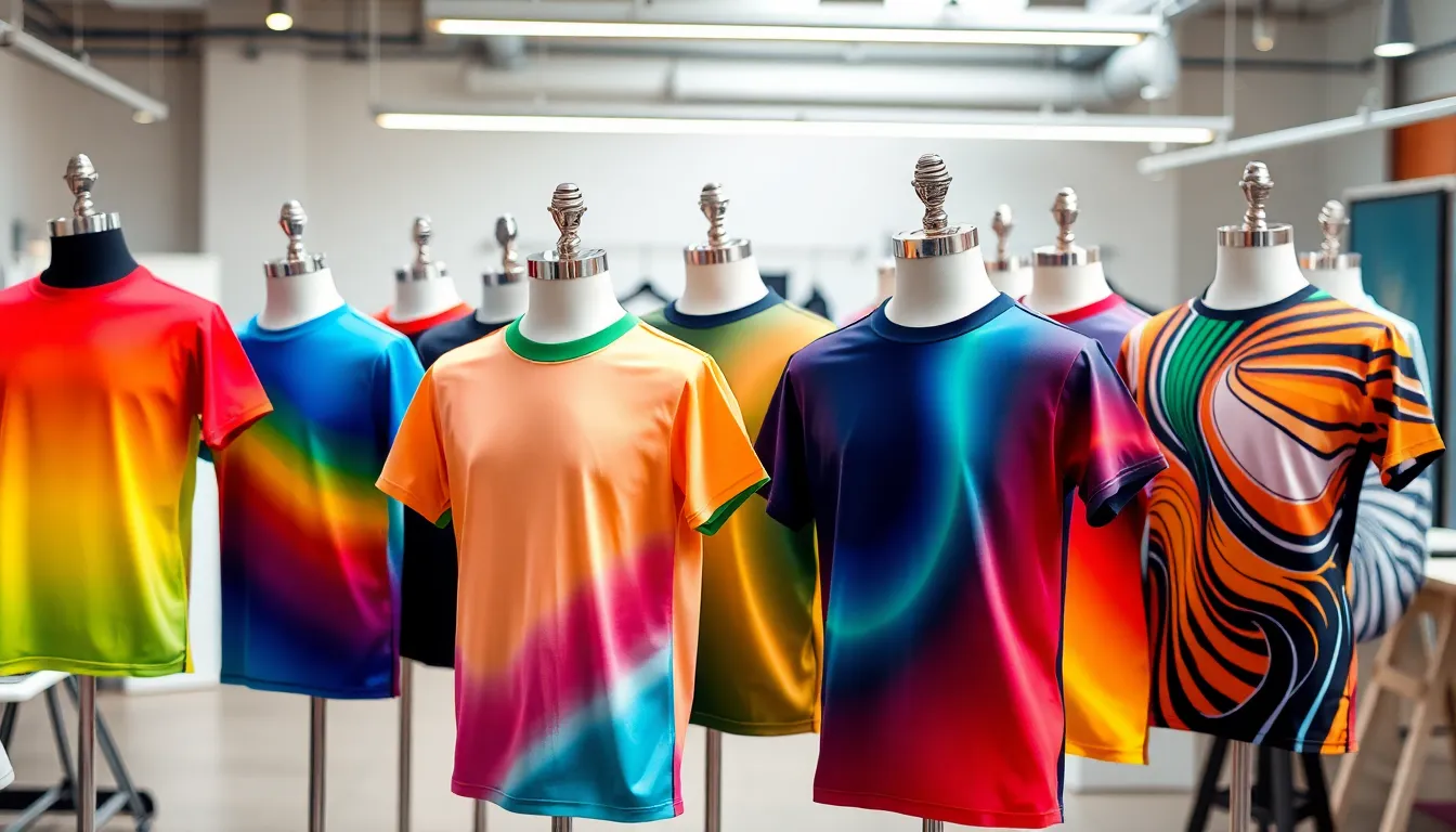
Color choices can transform a simple t-shirt design into a captivating visual experience that resonates with your target audience. We’ll explore how strategic color experimentation elevates your creative t-shirt designs beyond ordinary concepts.
Master the Art of Color Theory in T-Shirt Design
Understanding color relationships forms the foundation of impactful t-shirt design that connects emotionally with wearers. Complementary colors like blue and orange create ever-changing tension that draws attention instantly, while analogous combinations such as green, blue-green, and blue offer harmonious sophistication.
Warm colors including red, orange, and yellow evoke energy and excitement, making them perfect for sports teams, fitness brands, or motivational designs. Cool colors like blue, purple, and green communicate calmness and trust, ideal for wellness brands or professional services.
Triadic color schemes using three equally spaced colors on the color wheel create vibrant designs without overwhelming the viewer. We recommend starting with one dominant color that covers 60% of your design, adding a secondary color for 30%, and using an accent color for the remaining 10%.
Color temperature affects how your design feels to viewers, with warm palettes creating approachable, friendly vibes and cool palettes establishing professional, sophisticated impressions. Psychological associations play crucial roles too – red suggests passion and urgency, while green implies growth and sustainability.
Create Stunning Gradient Effects for Modern Appeal
Gradients bring depth and dimension to t-shirt designs while creating contemporary visual appeal that stands out in crowded markets. Linear gradients work exceptionally well for text overlays, creating smooth color transitions that guide the eye across your message.
Radial gradients emanating from central focal points add dramatic flair to logos and graphic elements, particularly effective for sunset designs, spotlight effects, or cosmic themes. Diagonal gradients create movement and energy, perfect for athletic wear or ever-changing brand messaging.
Subtle gradients using colors within the same family maintain sophistication while adding visual interest without overwhelming your core design elements. Bold gradient combinations featuring contrasting hues create striking effects that demand attention on retail displays.
Mesh gradients incorporating multiple color points produce complex, modern effects that work beautifully for abstract backgrounds or artistic statements. We suggest limiting gradients to 2-3 colors maximum to maintain print quality and avoid muddy results.
Digital gradient tools in design software allow precise control over color stops and opacity, enabling designers to create smooth transitions that translate well to screen printing and digital printing methods.
Use Contrasting Colors to Make Designs Pop
High contrast combinations ensure your t-shirt designs remain legible and impactful across various lighting conditions and distances. Black and white provide maximum contrast for text-heavy designs, ensuring readability while creating timeless appeal that never goes out of style.
Dark backgrounds with light text create premium, sophisticated looks that work particularly well for nightlife brands, luxury products, or artistic statements. Light backgrounds paired with dark elements offer clean, approachable aesthetics perfect for casual wear or family-friendly brands.
Complementary contrasts using opposite colors on the color wheel generate visual excitement – think purple backgrounds with yellow accents or red designs on green shirts. Value contrasts between light and dark versions of the same color create subtle depth while maintaining color harmony.
Split complementary schemes combine one base color with two colors adjacent to its complement, offering high contrast with more sophisticated color relationships than direct opposites. Monochromatic contrasts using different shades and tints of single colors create elegant, cohesive designs with built-in visual hierarchy.
Fluorescent accents against neutral backgrounds create modern, eye-catching effects that appeal to younger demographics and trend-conscious consumers. We recommend testing contrast ratios to ensure your designs maintain impact when printed on various fabric colors and textures.
Add Texture and Depth Through Design Techniques
Advanced texture techniques transform flat t-shirt designs into visually compelling masterpieces that capture attention and create lasting impressions.
Layer Elements to Create Visual Dimension
Layering different design elements creates depth that makes your t-shirt artwork pop off the fabric. We recommend starting with a background texture or pattern and building forward with your main design elements like text, illustrations, or graphics.
Overlapping shapes and images creates natural depth perception that guides the viewer’s eye through your design. Try placing larger elements in the background and smaller, more detailed components in the foreground to establish a clear visual hierarchy.
Transparency effects allow underlying layers to show through, creating sophisticated blending that adds complexity without overwhelming the design. We suggest using 50-80% opacity on middle layers to achieve optimal visual balance.
Multiple color layers build richness and prevent your design from appearing flat or amateur. Consider using darker tones in background layers and progressively lighter shades as you move forward, mimicking natural lighting conditions.
Use Shadow and Highlight Effects Strategically
Drop shadows create the illusion that design elements float above the t-shirt surface, adding instant dimensionality to any artwork. We recommend keeping shadow opacity between 20-40% and offsetting them 2-5 pixels from the main element for realistic results.
Inner shadows make text and shapes appear pressed into the fabric, creating a debossed effect that works particularly well with bold typography. This technique adds sophistication to minimalist designs without requiring complex artwork.
Highlight effects simulate light hitting raised surfaces, making flat designs appear three dimensional. We suggest placing highlights on the upper left portions of elements to match natural lighting patterns that viewers expect.
Gradient shadows transition from dark to transparent, creating more realistic depth than solid color shadows. These work exceptionally well with curved elements like circles or organic shapes where light would naturally fade.
Incorporate Fabric-Inspired Textures Into Your Artwork
Canvas textures give your digital designs an authentic, handcrafted appearance that resonates with audiences seeking unique, artisanal products. We recommend applying subtle canvas overlays at 15-25% opacity to maintain design clarity while adding tactile appeal.
Denim textures complement vintage and casual design themes, creating instant brand association with comfort and durability. These work particularly well with distressed fonts and weathered graphic elements.
Linen textures add elegance and sophistication to upscale t-shirt designs, making them appear more premium and worth higher price points. We suggest using finer linen patterns for formal or business casual shirt designs.
Distressed fabric effects simulate worn, vintage clothing that appeals to customers seeking authentic, lived-in aesthetics. Try combining multiple distress patterns with varying intensities to create realistic aging effects that don’t appear artificially applied.
Draw Inspiration From Pop Culture and Current Trends
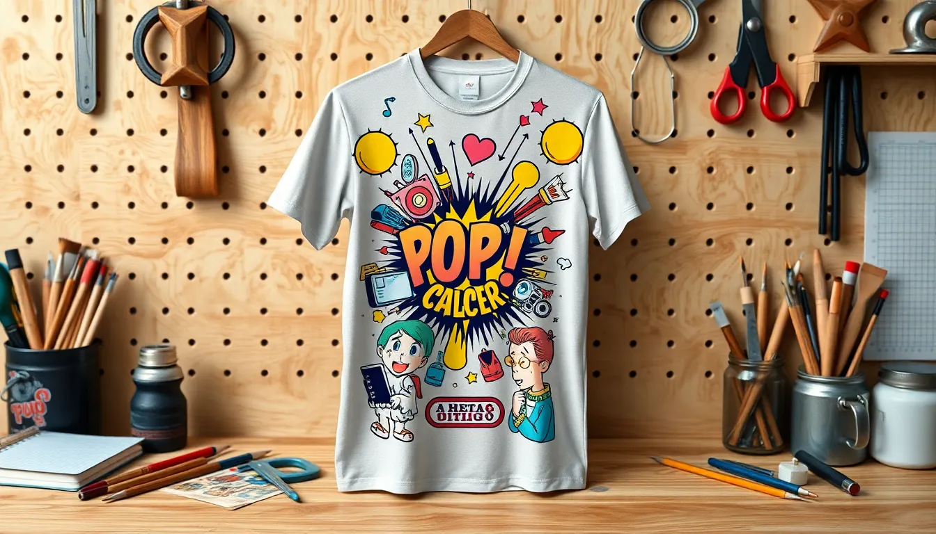
Pop culture serves as an endless wellspring of creative inspiration for t-shirt designers looking to connect with their target audiences. We tap into the collective consciousness by drawing from shared cultural experiences that resonate across demographics.
Reference Movies, Music, and Internet Culture
Movies provide rich visual and thematic elements that translate beautifully onto t-shirt designs. We find that iconic film quotes, memorable character silhouettes, and distinctive color palettes from popular films create instant recognition among fans. Superhero franchises, classic horror movies, and cult films offer particularly strong design foundations that generate emotional connections with wearers.
Music culture offers another powerful source of inspiration through album artwork aesthetics, band logos, and genre-exact visual styles. We incorporate elements like vintage concert poster typography, vinyl record graphics, and music note illustrations to create designs that speak to different musical communities. Hip-hop culture, rock and roll imagery, and electronic music aesthetics each provide distinct visual languages that resonate with exact audiences.
Internet culture spawns viral moments and digital art styles that translate into trendy t-shirt designs. We leverage popular gaming references, streaming platform aesthetics, and digital art movements like vaporwave or cyberpunk to create designs that feel current and relevant. Online communities often develop their own visual vocabularies that savvy designers can adapt for mainstream appeal.
Create Nostalgic Designs That Resonate With Your Audience
Nostalgic designs tap into powerful emotional connections by referencing shared memories from exact time periods. We target different generational groups by incorporating decade-exact elements like 80s neon colors, 90s grunge typography, or early 2000s Y2K aesthetics. Childhood favorites such as retro video games, classic cartoons, and vintage toy lines create instant emotional bonds with customers who grew up during those eras.
Television shows from past decades provide rich material for nostalgic t-shirt designs that celebrate cultural touchstones. We reference everything from Saturday morning cartoons to classic sitcoms, using recognizable characters, catchphrases, and visual styles that transport wearers back to formative experiences. These designs work particularly well when they subtly reference the source material rather than directly copying copyrighted elements.
Retro technology and vintage objects offer another avenue for nostalgic design inspiration that appeals across age groups. We incorporate imagery of cassette tapes, old-school video game controllers, rotary phones, and vintage computers to create designs that celebrate simpler times. These elements often work best when stylized or abstracted to create original interpretations rather than literal reproductions.
Stay Current With Social Media Trends and Memes
Social media platforms generate constantly evolving trends that smart t-shirt designers can quickly adapt into wearable designs. We monitor platforms like TikTok, Instagram, and Twitter to identify emerging visual styles, popular hashtags, and viral content that could translate into t-shirt graphics. The key lies in moving quickly to capitalize on trends before they become oversaturated or outdated.
Meme culture provides particularly fertile ground for t-shirt designs that connect with younger demographics through shared digital experiences. We transform popular meme formats, reaction images, and internet slang into wearable art that lets people express their online personalities in the physical industry. But, we must balance relevance with longevity, choosing memes with staying power rather than fleeting viral moments.
Platform-exact aesthetics offer another way to stay current with social media trends while creating designs that feel contemporary. We incorporate Instagram story templates, TikTok-style graphics, and Twitter thread aesthetics into t-shirt designs that reflect how people communicate digitally. These references create immediate recognition among social media users while establishing the wearer as culturally aware and connected.
Utilize Photography and Photo Manipulation
Photography transforms t-shirt designs into powerful visual narratives that capture attention and tell compelling stories. We’ll explore how strategic photo manipulation techniques can elevate your creative designs beyond traditional graphics.
Blend Photos With Graphic Elements Seamlessly
Layering photographs with vector graphics creates ever-changing compositions that combine realism with artistic interpretation. We achieve this by adjusting opacity levels between 30-70% to maintain visual balance while preserving essential details from both elements.
Masking techniques allow precise control over which portions of photographs remain visible in your design. We recommend using soft-edge masks for natural transitions and hard-edge masks for bold, geometric overlays that create striking visual contrasts.
Color matching ensures your photographic elements harmonize with graphic components throughout the design. We use color sampling tools to extract dominant hues from photographs and apply them to accompanying text or vector illustrations for cohesive brand consistency.
Scale variations between photographic and graphic elements add visual interest while maintaining design hierarchy. We position smaller graphic elements like icons or typography around larger photographic focal points to guide viewers’ attention through the composition effectively.
Create Artistic Effects With Image Filters
Vintage film filters transform modern photographs into nostalgic masterpieces that appeal to audiences seeking authentic, retro aesthetics. We apply sepia tones, grain textures, and vignette effects to create designs reminiscent of classic photography from the 1970s and 1980s.
High contrast adjustments dramatically alter the mood and impact of photographic elements in t-shirt designs. We increase shadow depth and highlight brightness by 25-40% to create bold, graphic qualities that translate effectively to fabric printing processes.
Duotone effects reduce complex color photographs to two complementary colors that align with your brand palette. We select contrasting hues like deep navy and bright orange or classic black and white combinations to create sophisticated, editorial-style t-shirt graphics.
Blur and motion effects add energy and movement to static photographs within your design compositions. We apply radial blur to backgrounds while keeping subjects sharp or use directional motion blur to suggest speed and dynamism in sports-related t-shirt designs.
Use High-Resolution Images for Professional Results
300 DPI minimum resolution ensures crisp, professional printing quality across all fabric types and printing methods. We source or capture images at 3000×3000 pixels or larger to maintain detail integrity when scaling designs for different t-shirt sizes from small to 3XL.
RAW file formats provide maximum flexibility during the editing and manipulation process for t-shirt design projects. We work with uncompressed RAW files that preserve all image data, allowing extensive color correction and exposure adjustments without quality degradation.
Vector conversion techniques transform high-resolution photographs into scalable graphics that maintain quality at any size. We use image tracing tools to convert photographic portraits into stylized vector illustrations perfect for single-color or limited-color printing applications.
Print-ready file preparation involves converting RGB images to CMYK color space and adjusting saturation levels for optimal fabric reproduction. We reduce image saturation by 15-20% to compensate for ink absorption in textile printing while maintaining vibrant color representation.
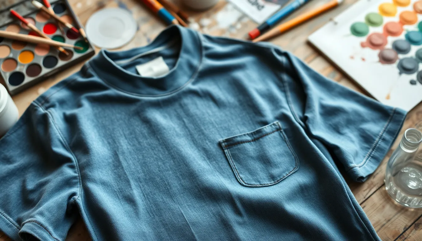
Design for Different T-Shirt Colors and Fabrics
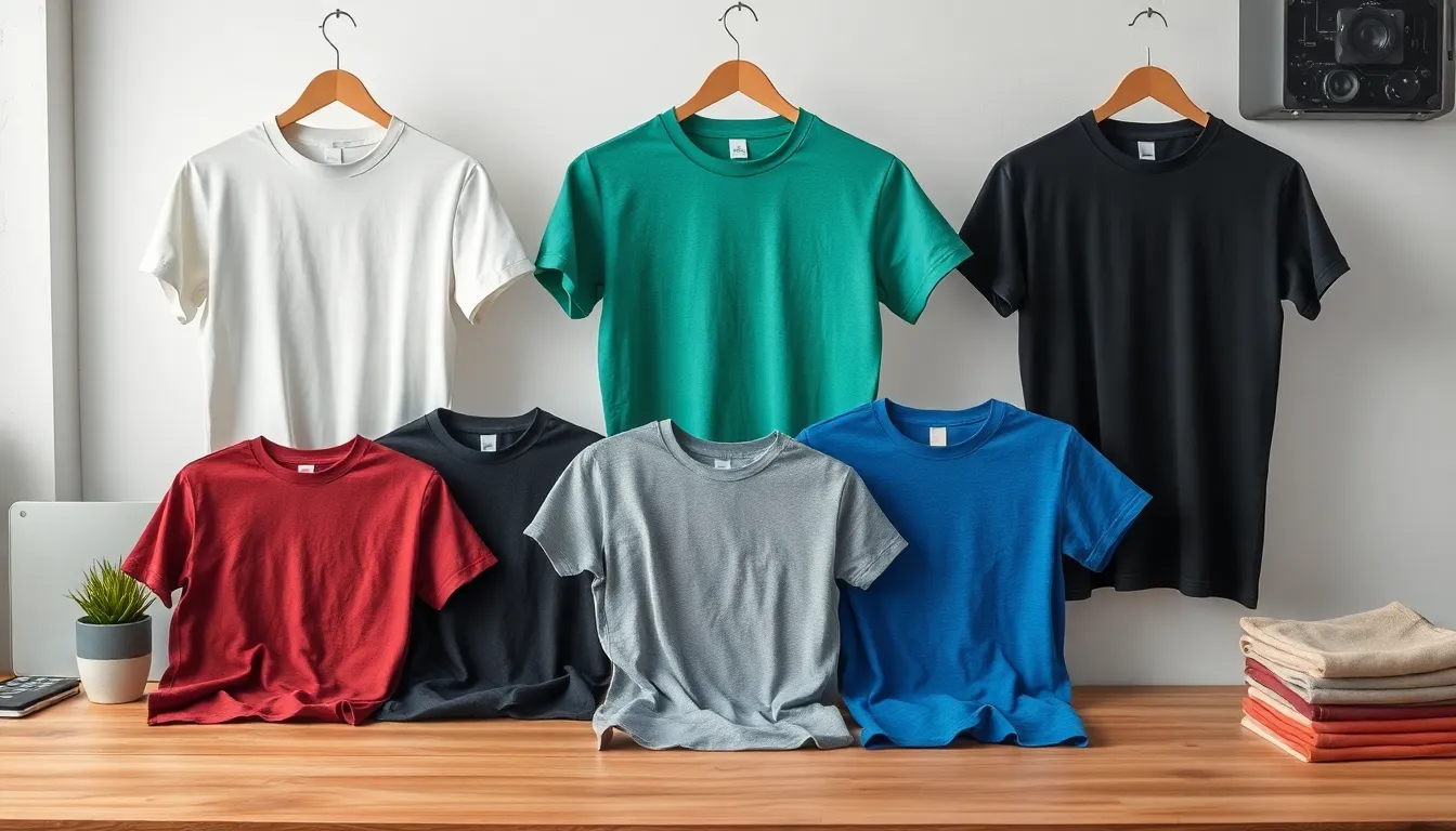
Successful creative t shirt design extends beyond visual appeal to cover practical considerations of color compatibility and fabric characteristics. Understanding how different materials and base colors affect your design choices ensures professional results across diverse garment options.
Adapt Your Design for Light and Dark Garments
White and light colored shirts offer the most versatility for creative t shirt design projects, allowing vibrant colors to appear true to their intended hues. Designs on light backgrounds can use subtle gradients, delicate details, and transparent effects without losing visual clarity. We recommend creating high contrast elements using dark colors like navy blue, forest green, or charcoal gray to ensure maximum readability on white cotton shirts.
Black and dark colored garments require strategic color adjustments to maintain design integrity and visual impact. Light colors such as white, cream, bright yellow, and neon shades create stunning contrast against dark backgrounds. Metallic foils, reflective inks, and glow in the dark materials work exceptionally well on black shirts, adding premium appeal to creative t shirt designs.
Mid tone shirts present unique challenges that require careful color selection to avoid designs that disappear into the fabric. Colors that are significantly lighter or darker than the shirt base work best, while avoiding similar tonal values that create muddy or unclear results. Testing color combinations digitally before printing saves time and materials while ensuring optimal visibility.
Consider How Different Fabrics Affect Print Quality
Cotton fabrics absorb inks deeply, creating rich color saturation that enhances creative t shirt design elements like detailed illustrations and photographic prints. Pure cotton materials hold fine details exceptionally well, making them ideal for intricate line work and small text elements. Preshrunk cotton prevents design distortion after washing, maintaining the integrity of your artistic vision.
Polyester blends require different ink formulations to achieve proper adhesion and color vibrancy in creative t shirt design applications. These synthetic fibers resist traditional water based inks, necessitating specialized printing techniques like heat transfer or sublimation printing. Polyester materials excel at moisture wicking properties, making them perfect for athletic wear designs and performance apparel applications.
Tri blend fabrics combining cotton, polyester, and rayon create unique texture variations that add visual interest to creative t shirt designs. The mixed fiber content creates subtle color variations within solid print areas, producing vintage inspired aesthetics. Print tests on tri blend samples help predict final results and adjust design elements accordingly.
Heather fabrics with their speckled appearance can enhance or interfere with creative t shirt design details depending on pattern density and color contrast. Fine details may get lost against busy heather backgrounds, while bold graphics and large typography maintain excellent visibility. Consider the heather pattern as part of your overall design composition rather than fighting against it.
Plan Color Schemes That Work Across Various Materials
Universal color palettes ensure creative t shirt design consistency across different fabric types and base colors. Primary colors like red, blue, and yellow maintain their visual impact regardless of material composition or garment color. Monochromatic schemes using various shades of single colors create sophisticated looks that work well on diverse fabric options.
High contrast combinations guarantee visibility and impact across all creative t shirt design applications, from cotton to polyester blends. Black and white pairings work universally, while complementary colors like orange and blue or purple and yellow create ever-changing visual energy. Test contrast ratios digitally to ensure designs remain readable at various sizes and distances.
Metallic and specialty inks add premium appeal to creative t shirt designs while working effectively across different fabric types. Gold foil accents create luxury aesthetics on both dark and light garments, while silver metallic inks provide modern technological appeal. Glow in the dark elements work best on darker fabrics where the charging and glowing effects are most visible.
Color temperature considerations help maintain design harmony across various material options in creative t shirt design projects. Warm colors like reds, oranges, and yellows create energy and excitement, while cool blues, greens, and purples convey calm professionalism. Balanced palettes incorporating both warm and cool elements provide versatility across different garment styles and target audiences.
Incorporate Interactive and Multi-Dimensional Elements
Modern t-shirt design transcends traditional flat graphics by embracing interactive elements that engage viewers through movement and discovery. We’re pushing creative boundaries by developing designs that respond to environmental changes and strategic garment placement.
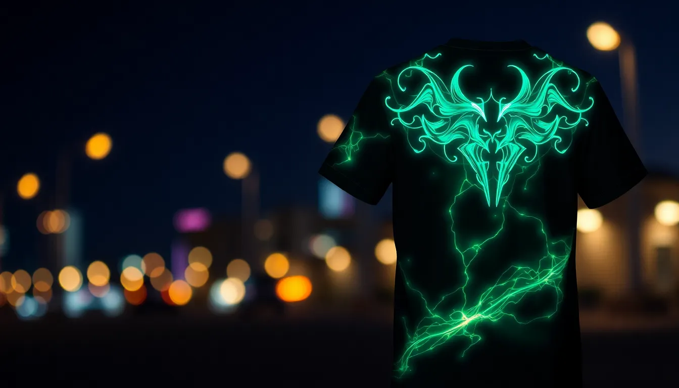
Create Designs That Change Under Different Lighting
Thermochromic inks revolutionize t-shirt design by shifting colors when exposed to body heat or temperature variations. We’ve seen designs that reveal hidden messages at 85°F or display completely different artwork when the wearer moves from air conditioning to sunlight. These specialty inks work particularly well for event shirts, promotional campaigns, and interactive brand experiences.
Photochromic materials respond to UV light exposure by changing from one color to another. We recommend incorporating these elements into outdoor brand designs, summer festival merchandise, or children’s apparel where the color transformation creates an element of surprise. The effect typically activates within 15-30 seconds of sun exposure.
Glow in the dark pigments add mysterious appeal to nighttime visibility designs. We’ve successfully used phosphorescent inks for safety awareness campaigns, concert merchandise, and Halloween-themed graphics. These materials charge under regular lighting and emit a soft glow for 2-4 hours in darkness.
Reflective elements create dramatic light interaction through strategic placement of retroreflective materials. We suggest combining reflective vinyl cuts with standard screen printing to achieve designs that appear completely different under camera flash or vehicle headlights.
Use Placement Strategically Across the Garment
Wrap around designs extend graphics beyond traditional front and back placement onto sleeves, sides, and shoulders. We’ve created compelling narratives by starting a design element on the front chest and continuing it around the torso to the back panel. This technique works exceptionally well for industry imagery, cityscapes, or continuous pattern designs.
Sleeve storytelling utilizes the arm area as extended canvas space for complementary design elements. We position key information like dates, locations, or supporting graphics on sleeves while maintaining the primary focal point on the chest or back. Sports teams and event organizers particularly benefit from this approach.
Collar and neckline integration transforms often overlooked areas into design opportunities through custom neck tags, collar prints, or inside label graphics. We’ve incorporated brand messaging, care instructions, or hidden easter eggs that create discovery moments for the wearer.
Pocket placement coordination aligns chest pocket designs with overall composition for cohesive visual flow. We ensure pocket graphics complement rather than compete with main design elements by using matching color palettes or continuing design themes across both areas.
Design Elements That Work Together Front and Back
Storytelling continuations connect front and back graphics through narrative progression or visual completion. We’ve developed designs where the front panel introduces a concept and the back panel reveals the resolution, creating engagement that encourages viewers to see both sides of the garment.
Visual weight distribution balances design density between front and back panels to prevent overwhelming the viewer. We typically place 70% of the visual impact on either the front or back while using the opposite side for supporting elements, text details, or subtle pattern repetition.
Color echo techniques repeat key colors from front designs in back elements to maintain visual cohesion. We select 2-3 primary colors from the main design and incorporate them strategically in the secondary panel through accents, backgrounds, or small graphic elements.
Typography hierarchy systems establish clear reading order between front and back text elements. We place primary messages on the front panel using larger, bolder fonts while positioning supporting information, credits, or additional details on the back in smaller, complementary typefaces.
Test and Refine Your Creative T-Shirt Design Concepts
Testing transforms good t-shirt designs into exceptional ones that resonate with audiences. We’ll explore essential refinement strategies that ensure your creative concepts translate perfectly from screen to fabric.
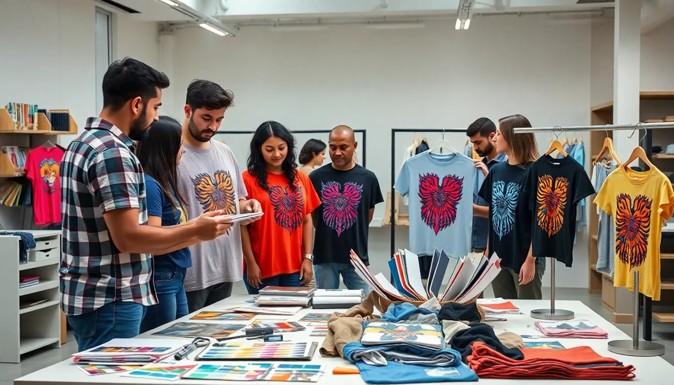
Get Feedback From Your Target Audience
Gather insights from potential customers before finalizing your creative t-shirt design concepts. We recommend creating digital mockups and sharing them across social media platforms where your target demographic actively engages. Focus groups of 8-12 people provide detailed qualitative feedback about color preferences, message clarity, and overall appeal.
Survey exact demographics to understand purchasing motivations and design preferences. Online polling platforms like Instagram Stories, Facebook polls, and dedicated survey tools help collect quantitative data about design elements. Ask targeted questions about font readability, color combinations, and emotional responses to your creative concepts.
Test multiple design variations with A/B testing methodologies to identify the strongest performers. We suggest presenting 2-3 design options simultaneously to measure engagement rates, comments, and sharing behaviors. Document which elements generate the most positive responses and incorporate these insights into your final designs.
Analyze feedback patterns to identify common themes and suggestions for improvement. Look for consistent comments about exact design elements, color preferences, or messaging clarity. Use this data to make informed decisions about typography adjustments, color modifications, or layout changes that align with audience expectations.
Make Iterations Based on Print Quality Tests
Print sample designs on actual t-shirt materials to evaluate real industry quality and appearance. We’ve found that colors often shift during the printing process, particularly when transitioning from RGB digital displays to CMYK or spot color printing methods. Test your designs on cotton, polyester blends, and tri-blend fabrics to understand how each material affects the final result.
Examine fine details and text legibility at actual print sizes to ensure optimal readability. Small fonts that appear clear on screen may become illegible when printed, especially on textured fabrics or dark garments. Test minimum font sizes of 8-10 points for body text and ensure decorative fonts maintain their character at reduced scales.
Evaluate color saturation and contrast levels across different printing techniques like screen printing, direct-to-garment, and heat transfer vinyl. Each method produces unique color characteristics and may require design adjustments for optimal results. We recommend creating color calibration charts to maintain consistency across different printing processes.
Assess durability through wash tests to ensure your creative t-shirt designs maintain their integrity over time. Wash printed samples multiple times using standard laundry practices to identify potential fading, cracking, or peeling issues. Document which design elements and printing methods provide the best longevity for your target market.
Ensure Your Design Scales Properly for Different Sizes
Create design templates for various t-shirt sizes from XS to 3XL to maintain visual proportions across the size range. We scale designs proportionally rather than simply enlarging them, as this approach ensures consistent visual impact regardless of garment size. Consider how design elements will appear on different body types and adjust placement accordingly.
Test typography scaling to ensure readability remains consistent across all shirt sizes. Fonts that work well on medium shirts may become too small on XS sizes or overwhelmingly large on 3XL garments. Establish minimum and maximum font sizes that maintain legibility while preserving your design’s aesthetic appeal.
Adjust spacing and layout elements to accommodate size variations without compromising your creative vision. We recommend creating exact guidelines for margin spacing, element positioning, and overall design proportions. This systematic approach ensures your t-shirt designs maintain professional quality across the entire size spectrum.
Verify that complex illustrations and detailed graphics retain their clarity when scaled for smaller sizes. Intricate artwork that looks stunning on large shirts may lose important details when reduced for smaller garments. Simplify overly complex elements or create size-exact variations to ensure your creative concepts translate effectively across all t-shirt sizes.
Conclusion
We’ve explored the multifaceted industry of creative t-shirt design where artistry meets functionality. From mastering typography and minimalist principles to experimenting with textures and interactive elements we’ve covered the essential techniques that transform ordinary garments into powerful visual statements.
Success in t-shirt design comes from balancing creativity with practical considerations. Whether you’re incorporating hand-drawn illustrations developing your signature style or working with photography each approach requires careful attention to color theory fabric compatibility and print quality.
The key lies in continuous experimentation and refinement. By testing our concepts gathering feedback and staying connected to cultural trends we create designs that not only look stunning but also resonate with our target audience. Remember that every great t-shirt design starts with a clear vision and grows through thoughtful execution.
Frequently Asked Questions
What makes typography important in t-shirt design?
Typography is crucial because it directly impacts readability and brand personality. Bold, sans-serif fonts work well for modern designs, while serif fonts suit vintage styles. The right font choice creates emotional connections with your audience and ensures your message is clear at various sizes, making your design both functional and memorable.
How can minimalist design principles improve my t-shirt graphics?
Minimalist design creates powerful visual impact through strategic use of negative space, clean lines, and limited color palettes. By letting one element be the focal point, you guide the viewer’s attention effectively. This approach enhances brand recognition, creates professional polish, and ensures your message isn’t lost in visual clutter.
Why should I incorporate hand-drawn illustrations in my designs?
Hand-drawn illustrations create unique connections with audiences by adding personal authenticity that mass-produced graphics lack. Starting with original sketches allows you to tell personal stories and develop characters that resonate emotionally. Digital tools can then enhance these elements while preserving their handcrafted charm and originality.
How do I develop a signature design style?
Develop your signature style through consistent practice and intentional artistic choices. Focus on recognizable color palettes, consistent line quality, and repeated design elements that customers can identify without seeing your logo. Balance consistency with creative growth, allowing your style to evolve while maintaining core visual elements.
What role does color theory play in t-shirt design?
Color theory is fundamental for creating emotionally impactful designs. Understanding complementary and analogous color schemes helps create harmony, while warm and cool colors evoke specific emotions. High contrast ensures legibility, and gradient effects add modern appeal. Strategic color choices can transform ordinary designs into compelling visual statements.
How can texture techniques enhance my t-shirt designs?
Advanced texture techniques transform flat designs into visually compelling masterpieces. Layer different elements with transparency effects, use shadows and highlights for dimensionality, and incorporate fabric-inspired textures like canvas or denim. These techniques add depth and authenticity, making your designs stand out from basic graphics.
Should I incorporate pop culture references in my designs?
Pop culture references can create powerful emotional connections when used thoughtfully. Movies, music, and internet culture provide shared experiences that resonate with target audiences. Nostalgic designs tap into powerful memories, while current trends and memes keep your work relevant and contemporary for modern consumers.
How do I effectively use photography in t-shirt design?
Blend photographs with graphic elements using masking techniques for precise control and ensure color harmony between components. Apply artistic filters for vintage or high-contrast effects, and always use high-resolution images for professional results. Convert to vector formats when necessary and prepare print-ready files for optimal quality.
What should I consider when designing for different fabric types?
Different fabrics affect print quality and color vibrancy. Cotton provides excellent print quality, polyester blends offer durability, and tri-blends combine comfort with print clarity. Adapt your color choices for light versus dark garments, ensure high contrast for visibility, and plan universal color schemes that work across various materials.
How can I add interactive elements to my t-shirt designs?
Modern t-shirt design can incorporate thermochromic inks that change with temperature or photochromic inks that react to UV light. Consider wrap-around graphics and sleeve storytelling for multi-dimensional narratives. Use strategic placement and color echo techniques to create cohesive designs that engage viewers beyond static graphics.
What’s the best way to test and refine my t-shirt designs?
Test designs through digital mockups and gather feedback from your target audience via surveys. Conduct A/B testing to identify the strongest variations and perform print quality tests on different fabrics. Scale designs properly for various t-shirt sizes, ensuring visual consistency and legibility across all garments before final production.